Area card
The area card lets you control and monitor an individual areaAn area in Home Assistant is a logical grouping of devices and entities that represents a room or space in your home, such as the living room, kitchen, or garage. [Learn more].
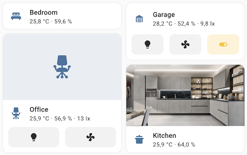 Screenshot of the area cards.
All options for this card can be configured via the user interface.
As shown in the screenshot of the area cards, they can display values and buttons of entities and devices that you have assigned the area to, such as:
- Buttons for entitiesAn entity represents a sensor, actor, or function in Home Assistant. Entities are used to monitor physical properties or to control other entities. An entity is usually part of a device or a service. [Learn more] such as fan, light, and switch that are in the area of the card.
- The measured value of a sensor, if the sensor is in the area of the card or if the sensor is assigned to the area in Settings > Areas, labels & zones.
- The median of the values measured by temperature sensors, if more than one temperature sensor is in the area of the card.
- The median of the values measured by humidity sensors, if more than one humidity sensor is in the area of the card.
- A motion sensor in the top left of the card, if a motion sensor is in the area of the card.
- The camera feed instead of the area picture, if a camera is added to the areaAn area in Home Assistant is a logical grouping of devices and entities that represents a room or space in your home, such as the living room, kitchen, or garage. [Learn more] of the card.
The device is in an area if you have previously assigned the area to the device.
Adding the area card to a dashboard
- In the top right of the screen, select the edit
button. - If this is your first time editing a dashboard, the Edit dashboard dialog appears.
- By editing the dashboard, you are taking over control of this dashboard.
- This means that it is no longer automatically updated when new dashboard elements become available.
- Once you’ve taken control, you can’t get this specific dashboard back to update automatically. However, you can create a new default dashboard.
- To continue, in the dialog, select the three dots
menu, then select Take control.
- If this is your first time editing a dashboard, the Edit dashboard dialog appears.
- Add a card and customize actions and features to your dashboard.
Adding buttons to the area card for controlling devices
You can add buttons to the area card that will allow you to control different devices in that area.
- Depending on your goal, do one of the following:
- Assign the area of the card to the device by following the steps in Assigning an area to a device.
- Assign the area of the card to a group of devices by following the steps in Assigning an area to multiple items.
- Go to your dashboard and, in the top-right corner, select the
button. - In the area card that you have previously created, select Edit.
- Expand the Features section and select Add feature > Area controls.
- You can also:
- Define the Features position by selecting Bottom or Inline.
- Customize controls to add a button for each device or entity, for example.
- Select the
button next to Area controls. - Turn on Customize controls.
- Select Controls and then select the entity from the list.
- Select Save.
- Select the
If you want to control only certain devices that are assigned to an area altogether, you can still use an area card. Create a new area and then follow the previous steps using the new area.
YAML configuration
The following YAML options are available when you use YAML mode or just prefer to use YAML in the code editor in the UI.
Configuration Variables
Set the color for the icon and the hover/focus state. It accepts color token or hex color code.
Defines the card’s display style. Options include compact (a minimal layout), icon (shows an area icon), picture (displays an image of the area), or camera (shows the live camera feed).
If showing a camera, live will show the live view if stream is enabled.
Forces the height of the image to be a ratio of the width. Valid formats: Height percentage value (23%) or ratio expressed with colon or “x” separator (16:9 or 16x9). For a ratio, the second element can be omitted and will default to “1” (1.78 equals 1.78:1).
Action taken on card tap. See action documentation.
Action taken on image tap (only available when display_type is icon, picture or camera). When not configured, image taps use the card’s tap_action. See action documentation.
more-info for camera display type, none otherwise
A list of binary sensor device classes which will populate alert icons in the card when the state is on. If the display type is set to compact, only the first alert icon will be displayed.
A list of sensor device classes to display for the area. Most classes (such as temperature, humidity, or pressure) show the median value when multiple sensors are present. Sensors representing cumulative measurements (such as power, energy, gas, or water) show the sum instead.
Additional widgets to control entities in the area. See available features.
Position of the features on the area card. Can be bottom or inline. Only the first feature will be displayed when the option is set to inline.
Example
Basic example:
type: area
area: bedroom
Complex example
type: area
area: bedroom
display_type: picture
tap_action:
  action: navigate
  navigation_path: /lovelace/my_bedroom
sensor_classes:
  - temperature
  - humidity
alert_classes:
  - moisture
  - motion
features:
  - type: area-controls
Available colors
The following colors are available to colorize the area card: primary, accent, disabled, red, pink, purple, deep-purple, indigo, blue, light-blue, cyan, teal, green, light-green, lime, yellow, amber, orange, deep-orange, brown, grey, blue-grey, black, white, or any hex color code (for example, #93c47d).